
The start of a new season means we finally get a glimpse at the brand-new machinery that each team will be using for the 21 races this season. While it’s far too early to judge the performance of each car, we can judge the cars based on their appearance.
Some people have probably already judged the cars based on the studio shots released by most of the teams ahead of the first pre-season test, but those can sometimes be misleading – evident by the fact that a lot of fans thought that the Ferrari was sporting an orange livery this year. It’s not until the cars hit the track for the first time in Barcelona that we can truly see what each car looks like during a race. Now that pre-season testing is underway, let’s review each team’s livery.
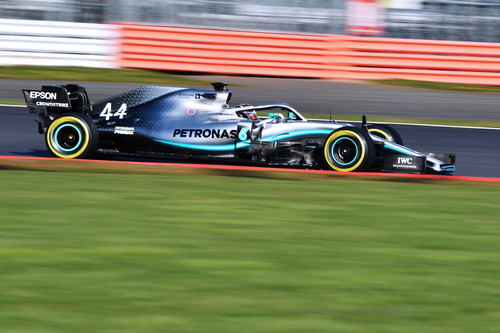
Let’s start with the defending world champions. In a move that appears to have been borrowed from the livery of Jaguar Formula-E team’s 2016 challenger, the Mercedes team has taken the opportunity to make the turquoise streak on the side of their car brighter and thicker to stand out more. Aside from that change, it’s business as usual for the German team, sporting their classic silver livery, living up to the Silver Arrows nickname. The only other major livery change is the use of black text on the car, which certainly makes the team’s sponsor Petronas more visible. The team has also opted to go with unified colours for the numbers, running black numbers on the nose and white numbers on the rear, ditching Hamilton’s red numbers and Bottas’ blue ones.
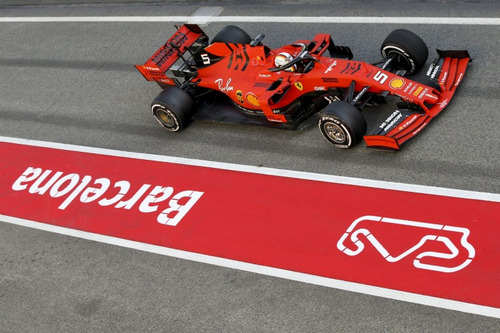
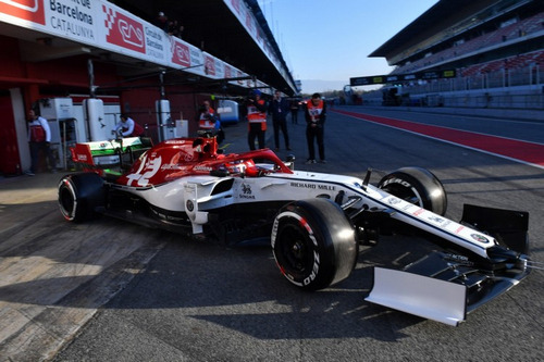
The Ferrari car sparked some discussion upon its release, leading some fans to believe that the car was orange and that the team had ditched the iconic Ferrari red that the team has run on their car for decades. But it was just the studio lighting that gave the car’s new matte paint an orange appearance. Even during testing, under certain lighting conditions, the car does appear to be more orange than red. But I digress.
It’s a nice change to see Ferrari dump the glossy paint for matte – which Red Bull has been running for many years now – because I think it looks nicer than the glossy finish. Apparently, it also has some performance gains in the weight reduction department. Unfortunately, the livery is yet another step back for the team, as they abandon what little white remained on their 2018 car, which is a shame since the 2016 and 2017 liveries with the classic white and Italian colours were two of my favourite recent Ferrari liveries.
The black section at the rear of the car with the white number is a great touch. The contrast really makes the numbers stand out in photos and TV broadcasts. Another negative visual aspect of the car is the Halo. Instead of blending it into the rest of the design, like other teams did, Ferrari chose to make it black. This makes it stand out a lot. Admittedly, the Halo was not as bad for the car’s appeal as people were originally predicting, but it does look a whole lot nicer when it’s blended with the rest of the car design.
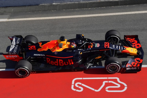
There’s not a whole lot to say about the Red Bull car. The livery is more or less the same design that they’ve run for years. I did like the livery when they first changed it to matte paint recently, but I can’t help but feel that the design is getting a little old and it would be very refreshing to see a livery revamp next year.
Like Ferrari, Red Bull opted for a black Halo, but they can pull it off a little better because it matches the dark livery of the Red Bull more than the bright red of the Ferrari. The only other really big visual quirk on the Red Bull car is the nose. While most teams gave their car a steeper nose, Red Bull instead made the incline on their nose shallower. The nose does look nicer when it doesn’t dip down as much, but it’s a trade off because now there is a step where the suspension for the car is. It reminds me of the 2012 cars, which in my opinion were super ugly cars.
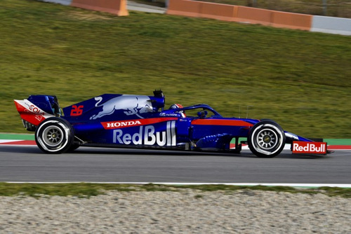
Like their sister team, Toro Rosso is again more of the same. Their livery is nearly identical to the 2017 and 2018 cars. While that design does look a lot nicer than the earlier Toro Rosso livery, which was essentially just a faded version of the Red Bull livery, it’s not a great design. It’s not horrifically bad, but it’s not great either. It’s just average.
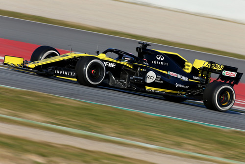
Renault is another team that stuck with the same old livery, opting to run a near carbon copy of their 2018 livery. The only big visual changes to the car are the numbers. The team now has a solid black number on the nose, compared to a black outline last season. Similarly, the back number is now a solid yellow instead of the yellow outline. Both changes make the numbers stand out a bit more. The only other noticeable welcome change is that the interior of the rear wing is now yellow instead of black, giving a bit more focus to the company’s main colour.
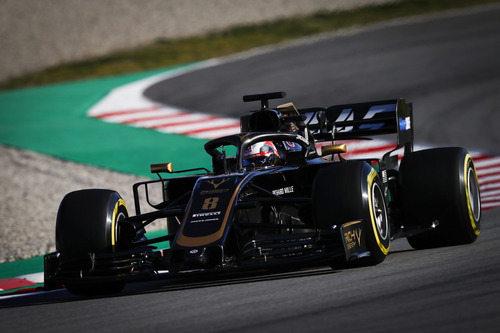
Respect to Haas, which was one of the two teams that underwent a livery overhaul. Gone is the grey, white, black and red colour pallet that we’ve seen from the American team since their debut season. Instead, the team has changed to a livery that appears to have been borrowed from the days of the John Player Lotus of the ‘70s. It’s a nice car, with my only complaint being that the side looks just a little too bare. Perhaps they could have gone with another strip running along the sidepod. But overall, I’d like to give Haas a round of applause for the most improved livery in 2019.

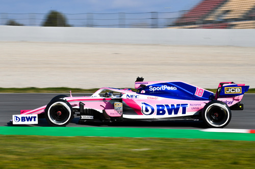
My biggest complaint with the Force India car in 2018 was that there was a lack of colour contrast between the pink and the white. It looked great in photos, but on the TV camera it didn’t look as great. Of course, I called their livery the best livery of 2018 and I stand by this. It’s a great livery. Force India… I mean Racing Point… expanded on their livery this year by adding dark blue to the engine cover, solving my complaint about the lack of contrast. The dark blue compliments the pink perfectly.
Similar to the Red Bull, although not quite as extreme, Racing Point also has a strange step on the nose. Like I explained previously, it’s not a design feature that I like because it’s way too similar to the nose disaster in 2012.
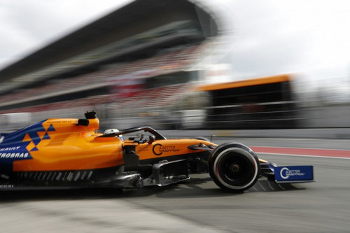
Appearance wise, the 2019 McLaren livery is a vast improvement over 2018. While I really liked the orange and blue combination in last year’s car, it was very much just an orange car with a blue shark fin stuck on. The blue near the rear of the car with the triangle design finally connects the two colours, which is something that was missing from last year’s car.
Where the car loses out is the nose. It’s not unusual for a team’s nose to be thinner than the chassis where the driver’s feet are, but rather tapering off the nose, the McLaren team has just split the nose into a wide section and a thin section, making the nose appear to be separate from the rest of the car. And of course, like the Ferrari, McLaren has made the Halo black even though it doesn’t match their livery design in any way.
Alfa Romeo’s livery is the same concept as the Sauber last season, but with some slight changes. There is more red on the car now, including the Halo and the rear wing, which were both white last season. The full Alfa Romeo badge has been replaced with a larger version of just the interior of their emblem, which is something that I don’t really care for.
Noticeably, the Alfa Romeo is missing the rear number on the car. They are the only team that doesn’t have a number visible from the side of the car. I thought that it was a regulation that you had to have the number on the side of the car, but apparently the FIA only requires the teams to have a number visible from the front and on the driver’s helmet.
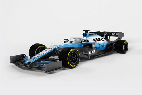
The Williams car is a hard one to judge, since the team has yet to show up to the pre-season testing. Their Martini livery was one that I really enjoyed, but with Martini bailing on the team after a horrifically bad 2018 season, the team signed with Rokit as their title sponsor. With this new sponsor comes a new livery. In fact, Williams is the only other team besides Haas to revamp their livery completely. Although, I’m not a fan of the change.
I don’t know what it is, but I just don’t like it. The engine cover looks strange with the with the blue and white blend, as does the nose. It looks kind of like the team designed a plain white car and someone took a couple of blue spray paint cans to the car. It’s not a design that I like.
The views and opinions expressed in this article are solely those of the author and do not necessarily reflect the official policy or position of any other agency, organization, employer or company. Assumptions made in any analysis contained within this article are not reflective of the position of any entity other than the author.
