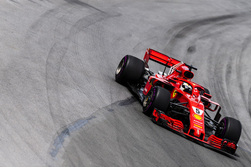
Although Ferrari ran a near flawless race this weekend in Canada, their pre-race activities were not nearly as flawless. The team’s marketing department made a few too many mistakes this weekend, to the point where I felt that it was actually quite disrespectful to Canada.

Ferrari started the lead up the Canadian Grand Prix on Wednesday by stirring up some controversy. They posted a video on their social media accounts, as they do before any race, with some quick facts about the circuit and the city. But there was one glaring error… the B-roll footage featured was from Toronto. The mistake was obvious, as the images featured the CN Tower, which is one of the most popular landmarks in the world according to Instagram data, but is not located in Montreal. It’s located in Toronto, which is in an entirely different province.
The mistake was pointed out by fans and quickly removed from their social media channels. They apologized and uploaded a corrected version of the video. Their Twitter apology read: “You spotted it immediately! Sorry guys, we posted the wrong video, here is the right one. Enjoy the #CanadianGP!”

The second big controversy of the weekend came that very same day with the race cover art that the team had selected. The cover art was posted to Twitter and featured the Ferrari of Sebastian Vettel racing through flying maple leaves set with the Canadian flag in the background. However, it was quickly spotted that the leaves featured on the cover art weren’t actually maple leaves.
There was some discussion on social media, with many believing that the leaves featured on the cover art were actually the leaves of a marijuana plant. Some believed that this was an accidental mistake from the marketing team, while others believed that it was a political statement on Canada’s recent decision to legalize the drug for recreational use.
However, I don’t personally believe that the leaves on the poster are marijuana leaves; I believe it’s a much more innocent mistake.

While the traditional Canadian maple leaf is featured on the flag, they may vary a bit in nature. However, the distinct features on the maple leaf are the 5 points and the jagged edges. While the leaves on the poster do feature the 5 points, they are far too smooth to be traditional Canadian maple leaves. Instead, they look like leaves from the Japanese maple. These trees are not found in Canada, making it an odd and unfitting choice for the cover art. It’s almost as though someone simply did an internet search for “maple leaf” and just picked the prettiest result, without actually looking to see that it wasn’t the correct leaf.
No apology was issued by the team for the obvious mistake and the cover art was featured for the entire weekend. Upon writing this, the cover art is still published on Twitter and was even used as the Ferrari cover photo for their social media accounts.
These two mistakes are fairly large and I find it be extremely insulting and disrespectful to the Canadian fans by showing such a lack of care and disinterest in conducting the necessary research of the country that is hosting the race.
The views and opinions expressed in this article are solely those of the author and do not necessarily reflect the official policy or position of any other agency, organization, employer or company. Assumptions made in any analysis contained within this article are not reflective of the position of any entity other than the author.