With Force India having revealed their 2018 challenger at the first day of pre-season testing and plenty of photos of the cars on track, now seems like a good time to rank and review the 2018 Formula One liveries. This list will be based on the appearance of the livery and the changes compared to previous seasons.

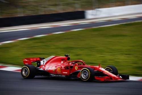
We are going to start out this list a little controversial because I think that the Ferrari livery is the worst livery this season. The 2016 livery was good for Ferrari because it brought back the white that was on the Ferrari cars in the late ‘70s and early ‘80s. However, the 2018 livery is a step backwards because the team removed pretty much all of the white that was there before and brought back the boring plain red livery again. It’s not a decision that I think anyone would have expected since there weren’t really any big complaints about the livery in 2016 and 2017.
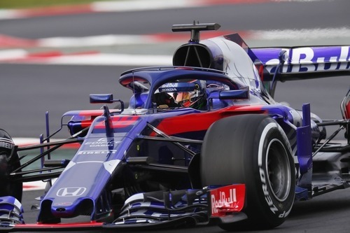
Toro Rosso is another team that made little to no changes to their livery compared to last year. They decided to remain with the blue and red livery that they had last year. But the disappointing this is that isn’t a good livery. Compared to their livery before, it was a big improvement because it distanced Toro Rosso away from Red Bull and gave the team an independent public image. That being said, I still don’t like the livery and there are a lot of things that could be done to improve it massively.
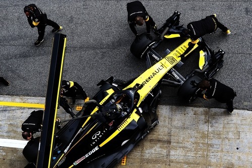
Renault is yet another team that didn’t change much in their livery this season. While it’s not a terrible livery, it could be a lot better. There is far too much black on the livery and not enough yellow, which is the Renault car. I would much rather see the Renault F1 car dressed up in the blue and yellow livery that the Renault edams team had in Formula E because it’s more traditional and it looks a lot nicer. Overall, I just think that black is an overused color on racing cars and I would like to see the team use some other color instead with a bigger focus on the Renault yellow.
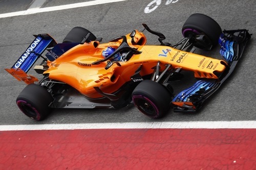
McLaren running the orange and blue livery was largely expected and had a lot of potential. The unfortunate thing is that the livery was executed horribly and just did not turn out good. Having a plain chassis with no design on it just doesn’t work. I like the color and I think that a car with these two colors would look quite nice, if it had a design on it. I think we all knew that McLaren was going to run the same livery that they used on their IndyCar, but it just doesn’t work. I would have much rather liked to see some stripes or something. It’s unfortunate because the team actually made an effort to improve their livery from last year, but I just can’t rank them higher than some of the other teams that made no effort or changes to their livery.
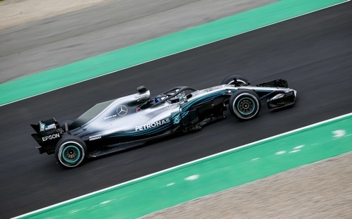
Mercedes is a team that hasn’t changed their livery much over the years. They are once again using the classic Mercedes silver with the Petronas colored lines flowing from the nose to the rear of the car. It’s a livery that we have all grown accustomed to. It looks like Mercedes made some minor refinements to the livery this year. They appear to have darkened the side of the nose and sharpened the lines to make them stand out more. It’s not a bad looking car, but it won’t make it any further up the list.
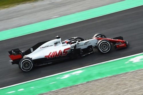
Haas rolled back their livery to what is pretty much a carbon copy of the 2016 livery. The 2017 livery was not a good as the year before and it’s good to see that Haas have realized that and dumped it. There is a nice blend of colors included on the livery, with the red, black, grey and white all blending together quite nicely. I like that the team attempted to draw attention away from the Halo by making it black and it fits into the livery. It’s a strong livery.
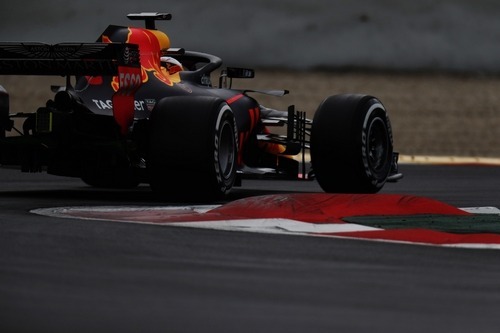
Red Bull is a team that always disappoints people. They come out with this nice livery for their car launch, but then they revert to the same old livery that they have run for many years. Fortunately for them, it’s not a bad livery. They have decided to stick with the matte paint, which is something that looks very nice on cars and I think some other teams should take advantage of. There’s not a huge amount to say about the livery because it’s one that looks nicer and has worked out well for the team. However, I did like their car launch livery a bit better and I think that their current livery is starting to get a bit old.
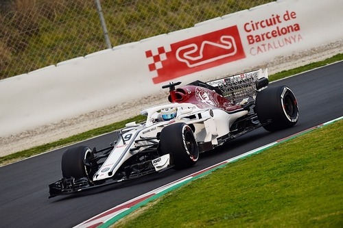
When I first saw the Sauber livery, I hated it. I was going to rank this one a lot lower than I did on this list, but I think that the more you look at, the more it grows on you. It’s a simple design, but that looks nice on the Formula One cars. I like the look of this car and I look forward to seeing it on the grid in 2018.
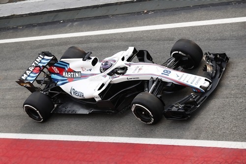
What did Williams change on their car livery this year? Nothing. But that’s ok because this is one of the nicest looking liveries on the F1 grid. It’s a simple and fast-looking design with a good color scheme. Since the car is white, I thought that the Halo would stand out a lot on the car, but it really doesn’t because it just fits in. I think the livery had a little bit more black added to the bottom and rear this season, which is a small but good improvement.
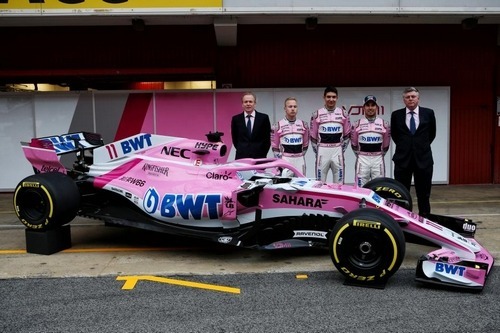
If you read my article yesterday, then it’s not a shock that the Force India livery is my favourite. I explained a lot about why that livery looks nice and a couple things that I would change on it, so for sure check that out. To summarize, the color scheme works great and it’s not a common one that you see in sports. The silver at the rear of the car is a perfect touch and the colors just stand out on the track. Adding the white to the livery transformed the boring pink livery from last season into a much better looking livery this year. It’s my favourite livery for sure in 2018.
The views and opinions expressed in this article are solely those of the author and do not necessarily reflect the official policy or position of any other agency, organization, employer or company. Assumptions made in any analysis contained within this article are not reflective of the position of any entity other than the author.