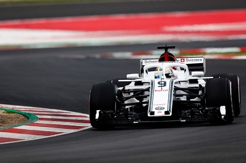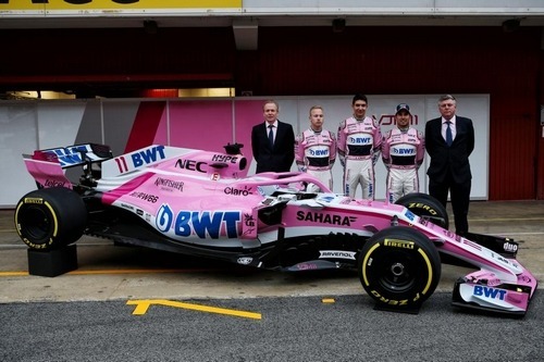
Now that all the 2018 cars have been revealed, it’s time to look at each one to see which cars looks the best. However, you can’t just label a single car as “the best” because sometimes the livery looks great, but the car is ugly, or vice versa. So, I’m going to reveal which car has the best livery and which car chassis looks the best.

There are a few new or revamped livery designs hitting the circuit this season. Unfortunately, not everyone looks that great and there are some teams that did very little to improve the design of their livery. I plan to rank and review the liveries in a later article soon, but for now, I will share that my favourite livery in 2018 is the Force India livery.
I didn’t really care for their 2017 livery, but their 2018 livery is a massive change for the better. The introduction of white to the livery really improves the appearance of the car by adding some contract to the pink. The team really picked a colour scheme that goes well together because the pink, dark pink and white mesh together flawlessly. The touch of silver at the rear of the car is a perfect touch and they were the only team to take advantage of the shark fin for sponsor advertisement. However, as with every good thing, there are a few tweaks that could be made to make it even better.
The nose of the car looks a little busy, so I would have removed the white stripe under the BWT logo near the antenna. I also would remove the white stripe that connects the mini shark fin and driver head rest. This stripe just seems out of place and has a negative impact on the appearance. However, these changes are minor compared to the changes that I would like to see on most of the other liveries on the grid.
But I don’t like the Force India car. While the livery looks fantastic, I hate the nose on the car and there are a couple other physical design elements on the car that I don’t like.

I think that Alfa Romeo Sauber has the best-looking chassis. It’s unique in a couple of ways. I like the double-air intake appearance that they have for the airbox above the driver’s head. Because that makes the airbox a little wider than the other cars, it makes the car flow nicer into the engine cover.
The nose of the car is also a big winner in my opinion. I really liked the flat square nose that Manor had in 2016 and I think that the 2018 Alfa Romeo Sauber looks a little similar to that. The nose still follows the same concept as the noses used by the other teams, with the solid middle area that extends slightly further than the rest of the nose. However, the physical structure of the nose combined with the livery makes the nose look a lot squarer, which I think looks a lot nicer.
At the end of the day, it doesn’t really matter what the cars look like because appearance doesn’t win races. So we will have to see how the cars perform in the pre-season testing.
The views and opinions expressed in this article are solely those of the author and do not necessarily reflect the official policy or position of any other agency, organization, employer or company. Assumptions made in any analysis contained within this article are not reflective of the position of any entity other than the author.