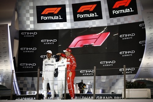
Following the podium ceremonies in Abu Dhabi, the Formula One management ended the season by revealing their new logo. It was revealed earlier in the week that the sport management had filed three trademark requests for three different logos, but would decide on the final one at the season finale.
To no one’s surprise, the rights managers selected the logo in which two curved lines make up the “F” and a single line makes up the “1”. The logo is apparently supposed to represent two cars racing to the finish line. It’s not really a shock that this logo was chosen, as the other two were simply appalling.
The new logo will replace the current logo, which has been used for over two decades and has become one of the most well-known logos in the world. There were a number of reasons listed for the brand change.

The primary reason cited for the logo change is the trend in current logos. Over the past few years, logos have become simpler and simpler. The current standard is a flat logo that is unicolor. The best example for seeing the trends of logos is Google. At launch the logo was some fancy serif text with some 3D beveling and shadows. After 2010, the logo quickly evolved year after year to remove the shadow then flatten the text and then change the sans-serif font.
Sean Bratches, the man in charge of the commercial aspect of Formula One, cited Coca-Cola and Starbucks as examples also. Starbucks is a good example because they stripped all of the text from their logo and converted their logo to a single green color. Coca-Cola is not a good example, because their logo has evolved slightly, but is still virtually the same as the logo used in the early 1900s.
The modern logos are becoming more simplified because it works better for digital marketing and merchandising.
Bratches also said that the majority of the fans don’t see the hidden “1” inside of the logo. Many of the fans simply think that the jagged red portion of the logo is the “1”, when in actuality the “1” is the transparent area between the “F” and red section.
“It served F1 extremely well over the past 23 years, but in terms of where we are taking the business and our vision for the business, it is the negative space in the ‘1’ doesn’t come through candidly in digital,” explained Sean Bratches. “If I were to have a poll of the number of people I’ve met and discussed the mark since I have gotten here, many of them have gone years and years without understanding the invisible space between the left and the right is actually a ‘1’. So, we wanted to keep it simple and clear. That is important for the digital space.”
The new logo is one step towards a complete reworking of the Formula One brand and huge change in how everything is done. Formula One is had a rapidly declining reputation in the sporting world as being a pretty closed off sport. The move to online streaming and a completely new web platform will be the sport’s first real venture into the digital world. A rebrand of this nature is surely an effort to wipe the slate clean and do away with any previous opinions of the sport that non-fans had.
Of the three proposed logos, I think that they chose the best looking one. That’s not really saying much though since all of the logos that they offered were pretty abysmal. There was nothing really special about any of them. When you make a logo, you want something that is memorable and stands out compared to the competition, but this just doesn’t really do it. There is nothing special about this logo at all.
And I really think that the whole argument about fans not seeing the hidden “1” in the logo is pretty irrelevant. I’m not ashamed to admit that it took me an entire year to realize that there was a “1” in that logo, but it really had no impact on my love for the sport or what I thought about the sport. Not many people know that the Amazon logo has an arrow pointing from “A” to “Z” to say that they have everything for sale or that the FedEx logo has an arrow hidden in it or that Tostitos features two stick figures dipping a chip or that Toblerone has a hidden bear in their logo, but that doesn’t matter. No one thinks any differently about those companies because of their logos.
I think it’s safe to assume that you readers have already figured out that I was strongly opposed to the new logo. The majority of you agreed with me in the poll I created when I first announced that Formula One was going to use a different logo. A logo doesn’t help Formula One at all; I would actually say that it hurts the brand. The sport is not really in a strong enough position yet to dump whatever positive image the brand has left. But it’s over and done with, so that is that.
The views and opinions expressed in this article are solely those of the author and do not necessarily reflect the official policy or position of any other agency, organization, employer or company. Assumptions made in any analysis contained within this article are not reflective of the position of any entity other than the author.